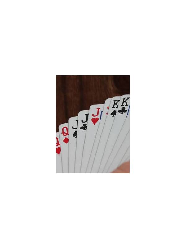
Rummy App Accessibility: Make Text and Contrast Easier to Read
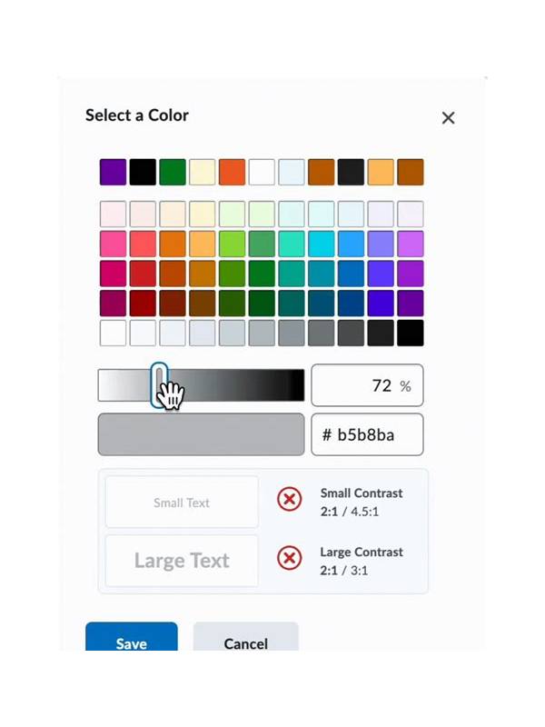
Card symbols that look clear on a large screen may become difficult to read on a phone, especially in bright light or after a long session. Accessibility settings can improve comfort and reduce visual mistakes before they affect a decision.
Start with display size and text size. Increase them gradually until card labels, buttons, and rule information are easy to read without covering important controls. Some apps use their own card-size setting, while others follow the device’s display preferences. Check both places and reopen the table to confirm the change.
Contrast is especially important for suits and action buttons. Use a display mode that separates the card face from the background, and avoid decorative themes that make symbols blend into the table. If the app offers a color-blind mode or suit symbols, test it with a sample hand rather than assuming color alone will remain sufficient.
Touch accuracy matters too. A crowded interface may cause a player to tap the wrong card or action. Use landscape mode if it provides more room, keep the device steady, and check whether the app supports confirmation before an irreversible move. A larger touch target is valuable even when the physical card image is not enlarged.
Reduce motion and distracting effects when possible. Animations can make it harder to track a draw, discard, or table message, particularly for players who experience visual fatigue. Notifications from unrelated apps should be silenced during a planned session so attention is not repeatedly pulled away from the hand.
Accessibility is also a safety feature. If you cannot read a rule, fee, timer, or confirmation screen comfortably, postpone the action and improve the display first. Never guess at a financial or account control because the text is too small. Use the official help page or support channel if a setting is unclear.
Test the layout before joining a timed table. Open a practice mode or settings screen and inspect suits, ranks, buttons, timer text, and any status messages. Ask whether you can verify a declaration without squinting or rushing. If the answer is no, change the device or app configuration.
Clearer presentation does not change the rules or guarantee better results. It simply gives the player a fairer chance to see the information that the table already provides. Comfortable, readable settings support more accurate and less tiring decisions.
If a setting makes the screen clearer but hides a control, test it in a noncompetitive mode first. Accessibility is successful when the whole table remains understandable, including warnings, confirmations, and account notices.
Related Post
Rummy Guide: Turn a Draw Into a Specific Question
Replacing vague hope with a specific draw question makes each new card easier to evaluate [...]
Rummy Guide: Use a Loose-Card Queue to Simplify Discards
A ranked loose-card queue turns a crowded hand into a manageable set of discard candidates. [...]