Rummy How-To: Build a Color-Blind-Friendly Card Review

Many rummy interfaces use suit colors to make cards easier to scan. That can be helpful, but color should not be the only signal in a review. A color-blind-friendly routine gives every card several identifying features, making decisions more reliable for everyone.
Start by reading rank and suit separately. Say the rank first, then the suit name, rather than relying on a red or black shade. If the interface uses tiny suit symbols, enlarge the display or choose a layout with clearer labels. A few extra seconds during practice can prevent a costly misread later.
Next, group cards by function. Put confirmed sequences in one mental column, possible sequences in another, and unconnected cards in a third. This works regardless of palette. If you sort physically or on a screen, keep the order consistent: confirmed groups on the left, flexible cards in the middle, and release candidates on the right. Consistency reduces visual searching.
Use shape and position as supporting cues. Notice whether a card belongs to a run by rank, a set by repeated rank, or neither. Do not treat an unusual icon as proof of a suit; verify the printed symbol. When reviewing a screenshot, crop away decorative backgrounds and keep the full card face visible. Avoid adding colored highlights that could hide the original suit mark.
Test the routine with a short drill. Look at five cards for a few seconds, cover them, and write each rank and suit in words. Then identify one possible run, one possible set, and one card with no clear role. Check the answer without judging speed. Accuracy comes first; speed follows from repetition.
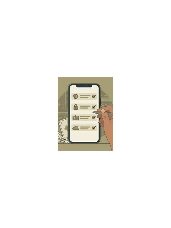
Finally, make your settings part of the pre-game checklist. Confirm text size, contrast, card spacing, and any accessibility mode before joining a table. A dependable review system is based on multiple cues, so a color change, dim screen, or unfamiliar theme does not force you to guess.
If you review with another person, describe the card instead of pointing to a color. “Seven of hearts” is clearer than “the red seven.” Ask the other person to confirm the symbol independently rather than treating agreement as a substitute for checking. In an app, test the routine on light and dark themes, and if available, on the platform’s high-contrast setting. Keep the same naming order in every drill. Over time, rank-and-suit language becomes automatic, while position and grouping provide a second layer of confirmation. This approach also helps when a card is small, partially obscured, or shown on a low-quality connection.
Related Post
Rummy How-To: Separate Facts From Guesses in a Hand Review
A fact-and-guess review keeps rummy analysis grounded and makes mistakes easier to correct. [...]
Rummy How-To: Design a One-Variable Practice Experiment
Change one part of your rummy routine at a time so you can tell which [...]